
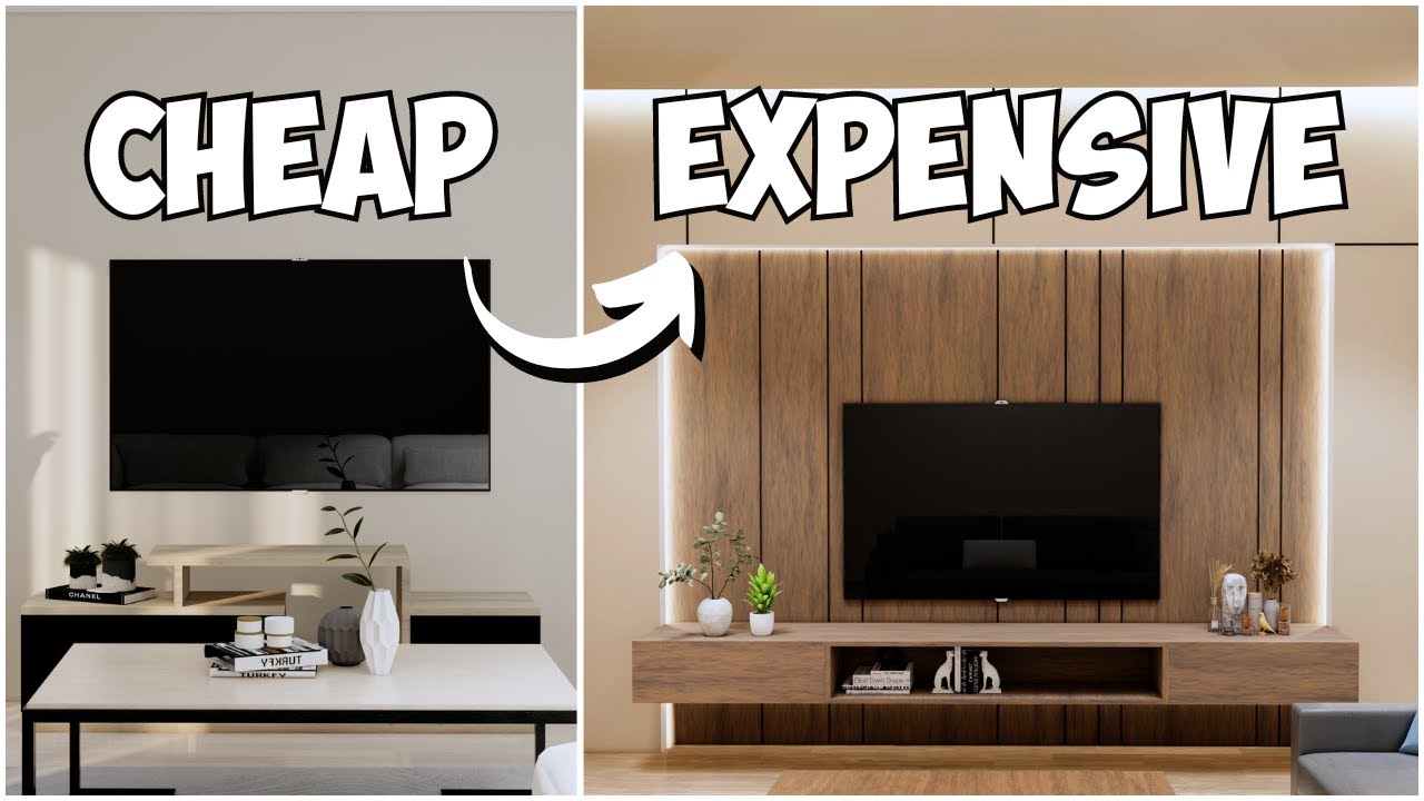
 Wall Decor
 Textiles & Rugs
 Flowers & Plants
 Candles & Candle Holders
 Furniture
 Home Accessories
 Window Treatments
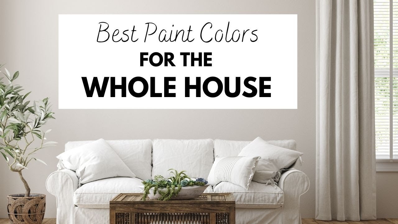
THESE Paint Colors Will Make Your House Feel Like HOME!

THESE Paint Colors Will Make Your House Feel Like HOME!
Transforming your space into a warm and inviting sanctuary starts with the right paint colors. In this article, we’ll explore paint colors that not only enhance the aesthetic appeal of your home but also create a sense of comfort and belonging. Whether you’re redesigning a single room or repainting your entire house, these colors will help you achieve that cozy, homey feel.
1. Soft Neutrals: The Foundation of Comfort
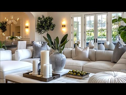
Soft neutral colors, such as beige, taupe, and light gray, serve as a perfect backdrop for any home design. These shades are timeless and versatile, allowing for a calm and serene atmosphere. By using soft neutrals, you can easily complement various decor styles, from modern to traditional.
Why Choose Neutrals?
- Versatility: Easily paired with vibrant accents.
- Light Reflection: Enhance natural light in your space.
- Timelessness: They never go out of style.
2. Warm Earth Tones: Inviting and Cozy
Warm earth tones like terracotta, olive green, and sandy browns resonate with the beauty of nature. These colors evoke feelings of stability and nurturing, making your home feel grounded and safe.
Benefits of Earth Tones
- Connection to Nature: Brings the outdoors inside.
- Emotional Warmth: Creates a nurturing environment.
- Richness and Depth: Adds character to any space.
3. Soft Blues: A Tranquil Retreat
Light blues and soft aqua shades impart a sense of calm and tranquility. Perfect for bedrooms or relaxation spaces, these colors mimic the serene qualities of water and sky.
Soft Blues Offer
- Peacefulness: Ideal for encouraging relaxation.
- Visual Openness: Makes rooms appear larger and airier.
- Versatile Pairing: Works well with whites and other pastels.
4. Gentle Pinks: A Touch of Warmth
Gone are the days when pink was solely associated with little girls’ rooms. Gentle blush and muted rose shades add warmth and charm to any room. This hue is excellent for creating a cozy and inviting atmosphere.
Why Gentle Pinks?
- Romantic Touch: Adds a soft, inviting vibe.
- Warm and Welcoming: Creates a homely feel.
- Stylish Modernity: Works well with contemporary designs.
5. Nature-Inspired Greens: Fresh and Invigorating
From soft sage to deep forest green, shades of green bring a refreshing vibe to your home. This color symbolizes growth and renewal, making it perfect for spaces where you want to inspire creativity and well-being.
Advantages of Greens
- Invigorating: Boosts energy levels.
- Connection to Nature: Promotes calmness and relaxation.
- Harmonious Balance: Pairs beautifully with other colors.
6. Bold Accents: Contrasting Serenity
While the main colors create a soft palette, adding bold accent colors like deep navy, rich burgundy, or vibrant mustard can bring personality and flair to your home. These colors work well in small doses through accent walls, furniture, or decor pieces.
Impact of Bold Accents
- Visual Interest: Creates focal points in rooms.
- Personal Touch: Reflects individual style.
- Dynamic Contrast: Energizes softer palettes.
Conclusion
Choosing the right paint colors is essential for creating a home that feels personal and inviting. By incorporating soft neutrals, warm earth tones, calming blues, gentle pinks, nature-inspired greens, and bold accents, you can establish a space that feels entirely like you. Embrace these colors to turn your house into a true home, one that resonates with warmth, comfort, and style. Start your painting project today and watch your sanctuary come to life!


Everybody picks such boring colours. Where are the skittles colours of the 1970s?
I don't know why people love there boring washed out grey colours!!!
It would be so helpful if you would put the name of each paint over the pictures you show. Then when I do screenshots of them I don’t have to type the color names with them. Thanks!
Soooooo glad we took your advice on the creamy mushroom. It is absolutely beautiful in our living and dining room.
What company?
Love Wild Truffle
What company is creamy mushroom?
more like "THESE paint colors will make your house feel like YOU'RE AT WORK"
what color should i paint my concrete fireplace
I love shoelace, it’s the PERFECT creamy white
Nice thx
Show more on colors, not your face
Need a paint color for low lit rooms and north facing rooms
Funny how “neutral” colours are only shown with white and other neutral colours. A true neutral goes with a wide variety of furnishing colours.
Greeneige is the prettiest, I think .
This is exactly the reason why I have had a stick with the color heartwood lying underneath my window for 6 years and now that I am finally moving into a new apartment, Gray still bores the hell out of me. Love it Hate it Love it Hate… what a nightmare. Gets me so indecisive 🤷🏻♀️
So tired of grey. All of these are too grey.
All modern oriented. Nothing for us folks with natural woodwork.
I am loving that Truffle color. Who makes these colors of paint? I did not hear white manufacturer was.
Velcro shoelace sing heathen is what got me laughing. Thanks for that James. I’m trying to pick colors for my new house and binge watching all your videos but sad to say it’s not helping me that much.
I just had a home we remodeled painted and used Oxford white. Wanted nice white wall. The walls now have a green tone to them agh! Think the new windows and the led can lights changed the colour is that possible? If so can you talk about that and how to choose if you have a lot of led can lights – Thank you
Nope to those. Bored with gray and any color close.
As a practicing pagan/heathen, I love the idea of claiming the Velcro sneaker as a religious symbol 0:51
😅
I hate gray with a living passion we use a pale yellow it matches everything and it’s like a pale camel yellow tone so neutral and warm and bright
Grey is out
Creamy Mushroom is beautiful! If you agree but would enjoy a very subtle hint of lavender/mauve, try Elephant's Breath by Farrow & Ball or Hazelwood by Benjamin Moore. Gorgeous colors.
Clearly, beauty is in the eye of the beholder, and tastes differ madly. I'd go with NONE of these "warm" colors. No thanks.
What is a good trim white for creamy mushroom or smokestack?
I just painted my living, dining, kitchen and hallway in creamy mushroom and it is beautiful! Very warm and inviting and definitely a brownish tone which I love! Really brings out the tones in the mahogany woodwork!
This is was so helpful WOW thank you
No more grey please. People want color
I have gray tile floors that look like wood boards…open concept home, i don’t want my house to look cold, what color so you recommend for my walls? My kitchen is white but i painted the island SW sticks and stones… do i do a white? Which white for the walls… im in the construction process, need to decide soon thanks
Hi James, love the video, I tend to like the warmer aspect of colors. I would like to ask, which colors would you recommend for kitchens, either for cabinets or walls. Thank you,
looking for a warm neutral main color to coordinate with doors and trim in Pashmina, shoelace will be looked at!
I'm studying up now on many videos of neutral paint colors, trying to find something, anything that is a little bit happy. The repeat of these maybe 8-10 basic colors again and again is oppressive to the human spirit. I still don't understand why people love to hide in the dullest of colors in which actual happy, expressive, excitatory color is absent. Must I please the herd of color hating people to rent or sell my otherwise nice house?…
Gray is not a warm color and it's everywhere. It's ruining gray for me.
Is stone white Benjamin Moore?? Where's it from please!
I found my vinyl colour on a paint chart card and then went for the lightest tone on the colour card ..perfect and easy!
Are these colors Sherwin Williams?
We just got utterly beige
Yecch! 😝
Ooh Wild Truffle!! Both interior shots were perfection, in my opinion, very tantalizing!
Thank you for the warm whites. I once pained an entire living-room/dining-room in a fairly open-plan older home (Craftsman) a pale, whipped-butter, yellow (matte) with true white semi-gloss trim. It was delicious. One could tell that it was, in fact, yellow (not white, not cream, not off-white) but the yellow was so light & delicate that it functioned as a neutral. I found it to be a very peaceful space, not loud or garish or "too much". I got the idea from seeing some renovations to the White House organized and supervised by Jackie Kennedy. Neoclassical architecture looks beautiful with a very pale main color (sky blue, butter yellow, or blush) with true white trim. There is so much trim (wainscoting, baseboards, crown molding, built-in case work, window frames, ceiling treatments like medallions, etc.) that the white kind of dilutes the impact of the colors in a light-bright way.
NO MORE GRAY!